
Qué es DatePicker
El componente DatePicker permite al usuario seleccionar una fecha y/u hora. Es un componente equivalente a UIDatePicker de UIKit.
Aquí podéis consultar la documentación oficial
El componente consta de varios inicializadores donde algunos de sus parámetros son opcionales. Estos parámetros modifican el comportamiento del componente para restringir franjas de fechas seleccionables o decidir si mostrar el componente de hora y/o fecha. A continuación vamos a ver todos los parámetros disponibles:
String: texto a mostrar para introducir alPicker. EsteStringse muestra dependiendo delDatePickerStyley el contexto, como cuando lo incluimos en unNavigationView→Form.selection: variable de estado de tipoDatecon la selección actual delDatePicker.in: rango que limita la selección del componente. Permite tres tipos de rango:ClosedRange: es un rango de fechas cerrado. Por ejemplo una semana:
Date()...Date(timeIntervalSinceNow: 60*60*24*7)
PartialRangeFrom: rango parcial que limita la fecha de inicio de inicio seleccionable. Por ejemplo a partir de hoy.
Date()...
PartialRangeThrough: rango parcial que limita la fecha de fin seleccionable. Por ejemplo, hasta hoy:
...Date()
displayedComponents: indica si permitimos seleccionar la hora (.hourAndMinute), la fecha (.date) o ambos ([.hourAndMinute, .date])label:Viewa mostrar para introducir alPicker. EstaViewse muestra dependiendo delDatePickerStyley el contexto, como cuando lo incluimos en unNavigationView→Form.
Nota: el parámetro selection es una variable de estado que usará el componente DatePicker para asignar el valor seleccionado. Cuando queremos usar un valor fijo (por ejemplo, por motivos de pruebas) podemos usar la función .constant() que pertenece al struct Binding para cumplir con su implementación sin tener que declarar la variable de estado.
La combinación de estos parámetros nos permite crear componentes con diferentes límites.
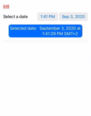
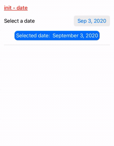
Simple
struct ContentView: View {
    @State private var selectedDate: Date = Date()

    var dateFormatter: DateFormatter {
        let formatter = DateFormatter()
        formatter.dateStyle = .long
        formatter.timeStyle = .long
        return formatter
    }

    var body: some View {
        ScrollView {
            VStack(spacing: 15) {
                Group {
                    DatePicker("Select a date", selection: $selectedDate)
                    HStack(alignment: .firstTextBaseline) {
                        Text("Selected date:")
                        Text("(selectedDate, formatter: dateFormatter)")
                            .multilineTextAlignment(.center)
                    }
                    .padding(.all, 5)
                    .foregroundColor(.white)
                    .background(Color.blue)
                    .clipShape(RoundedRectangle(cornerRadius: 10))
                    Divider()
                }
            }
            .padding()
        }
    }
}
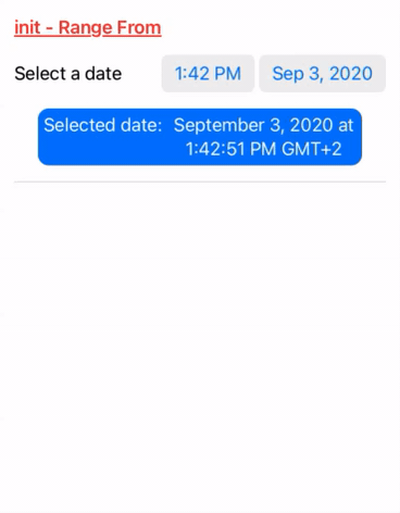
Fecha Desde definida
Ejemplo: no permitir seleccionar una fecha menor al día actual:
struct ContentView: View {
    @State private var selectedDate: Date = Date()

    var dateFormatter: DateFormatter {
        let formatter = DateFormatter()
        formatter.dateStyle = .long
        formatter.timeStyle = .long
        return formatter
    }

    var body: some View {
        ScrollView {
            VStack(spacing: 15) {
                Group {
                    DatePicker("Select a date", selection: $selectedDate, in: Date()...)
                    HStack(alignment: .firstTextBaseline) {
                        Text("Selected date:")
                        Text("(selectedDate, formatter: dateFormatter)")
                            .multilineTextAlignment(.center)
                    }
                    .padding(.all, 5)
                    .foregroundColor(.white)
                    .background(Color.blue)
                    .clipShape(RoundedRectangle(cornerRadius: 10))

                    Divider()
                }
            }
            .padding()
        }
    }
}
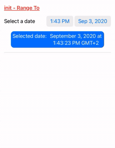
Fecha Hasta definida
Ejemplo: no permitir seleccionar una fecha mayor al día actual:
struct ContentView: View {
    @State private var selectedDate: Date = Date()

    var dateFormatter: DateFormatter {
        let formatter = DateFormatter()
        formatter.dateStyle = .long
        formatter.timeStyle = .long
        return formatter
    }

    var body: some View {
        ScrollView {
            VStack(spacing: 15) {
                Group {
                    DatePicker("Select a date", selection: $selectedDate, in: ...Date())
                    HStack(alignment: .firstTextBaseline) {
                        Text("Selected date:")
                        Text("(selectedDate, formatter: dateFormatter)")
                            .multilineTextAlignment(.center)
                    }
                    .padding(.all, 5)
                    .foregroundColor(.white)
                    .background(Color.blue)
                    .clipShape(RoundedRectangle(cornerRadius: 10))

                    Divider()
                }
            }
            .padding()
        }
    }
}
Fecha Desde y Hasta definida
Ejemplo: permitir seleccionar una fecha que esté en un rango de una semana anterior o posterior.
struct ContentView: View {
    @State private var selectedDate: Date = Date()

    var dateFormatter: DateFormatter {
        let formatter = DateFormatter()
        formatter.dateStyle = .long
        formatter.timeStyle = .long
        return formatter
    }

    var body: some View {
        ScrollView {
            VStack(spacing: 15) {
                Group {
                    DatePicker("Select a date", selection: $selectedDate, in: Date(timeIntervalSinceNow: -60*60*24*7)...Date(timeIntervalSinceNow: 60*60*24*7))
                    HStack(alignment: .firstTextBaseline) {
                        Text("Selected date:")
                        Text("(selectedDate, formatter: dateFormatter)")
                            .multilineTextAlignment(.center)
                    }
                    .padding(.all, 5)
                    .foregroundColor(.white)
                    .background(Color.blue)
                    .clipShape(RoundedRectangle(cornerRadius: 10))

                    Divider()
                }
            }
            .padding()
        }
    }
}

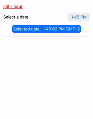
Solo hora
Solo permite seleccionar la hora:
struct ContentView: View {
    @State private var selectedDate: Date = Date()

    var dateFormatter: DateFormatter {
        let formatter = DateFormatter()
        formatter.dateStyle = .none
        formatter.timeStyle = .long
        return formatter
    }

    var body: some View {
        ScrollView {
            VStack(spacing: 15) {
                Group {
                    DatePicker("Select a date", selection: $selectedDate, displayedComponents: .hourAndMinute)
                    HStack(alignment: .firstTextBaseline) {
                        Text("Selected date:")
                        Text("(selectedDate, formatter: dateFormatter)")
                            .multilineTextAlignment(.center)
                    }
                    .padding(.all, 5)
                    .foregroundColor(.white)
                    .background(Color.blue)
                    .clipShape(RoundedRectangle(cornerRadius: 10))
                    Divider()
                }
            }
            .padding()
        }
    }
}
Solo fecha
Solo permite seleccionar la fecha:
struct ContentView: View {
    @State private var selectedDate: Date = Date()

    var dateFormatter: DateFormatter {
        let formatter = DateFormatter()
        formatter.dateStyle = .long
        formatter.timeStyle = .none
        return formatter
    }

    var body: some View {
        ScrollView {
            VStack(spacing: 15) {
                Group {
                    DatePicker("Select a date", selection: $selectedDate, displayedComponents: .date)
                    HStack(alignment: .firstTextBaseline) {
                        Text("Selected date:")
                        Text("(selectedDate, formatter: dateFormatter)")
                            .multilineTextAlignment(.center)
                    }
                    .padding(.all, 5)
                    .foregroundColor(.white)
                    .background(Color.blue)
                    .clipShape(RoundedRectangle(cornerRadius: 10))
                    Divider()
                }
            }
            .padding()
        }
    }
}
Cómo leer datos de un DatePicker
El DatePicker maneja tipos de datos Date. Su parámetro selection, que encontramos en su ‘inicializador’, define la fecha actual que debe mostrar el DatePicker y también se modifica con la fecha que el usuario selecciona en el componente. Esta variable es una variable de estado que debemos definir previamente, y en ella estará en todo momento el valor actual de la fecha del DatePicker.
La declaración de la variable se realiza de la siguiente forma:
@State private var selectedDate: Date = Date()
Y para usarla tenemos que pasarla como parámetro al DatePicker.
DatePicker("Select a date", selection: $selectedDate)
Modificadores comunes para DatePicker
El componente DatePicker comparte los mismos métodos de personalización que el componente View y pueden ser consultados en el siguiente enlace.
Los siguientes modificadores son muy comunes para usarlos en este componente.
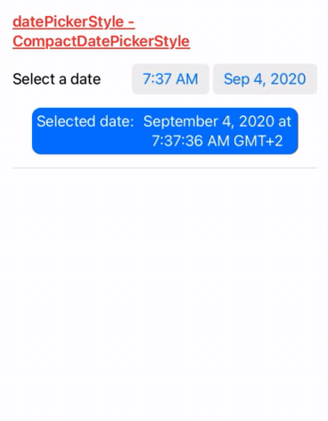
datePickerStyle
Permite alternar entre diferentes modos de presentación del DatePicker. El parámetro debe implementar el protocolo DatePickerStyle.
struct ContentView: View {
    @State private var selectedDate: Date = Date()

    var dateFormatter: DateFormatter {
        let formatter = DateFormatter()
        formatter.dateStyle = .long
        formatter.timeStyle = .long
        return formatter
    }

    var body: some View {
        ScrollView {
            VStack(spacing: 15) {
                Group {
                    DatePicker("Select a date", selection: $selectedDate)
                        .datePickerStyle(CompactDatePickerStyle())
                    HStack(alignment: .firstTextBaseline) {
                        Text("Selected date:")
                        Text("(selectedDate, formatter: dateFormatter)")
                            .multilineTextAlignment(.center)
                    }
                    .padding(.all, 5)
                    .foregroundColor(.white)
                    .background(Color.blue)
                    .clipShape(RoundedRectangle(cornerRadius: 10))
                    Divider()
                }
            }
            .padding()
        }
    }
}
Para iOS existen diferentes implementaciones:
CompactDatePickerStyle (iOS 14)
Es el tipo por defecto que se usa si no se indica nada.
.datePickerStyle(CompactDatePickerStyle())
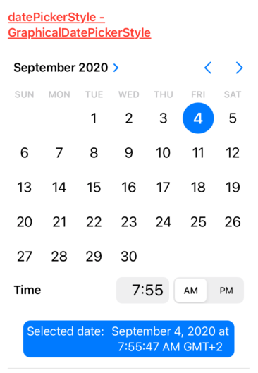
GraphicalDatePickerStyle (iOS 14)
Muestra el propio calendario para embeberlo en una pantalla.
.datePickerStyle(GraphicalDatePickerStyle())
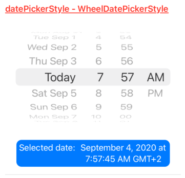
WheelDatePickerStyle
Es el estilo visual del componente UIDatePicker de UIKit.
.datePickerStyle(WheelDatePickerStyle())
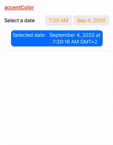
accentColor
Permite modificar el color de resalto de los textos del calendario del DatePicker.
struct ContentView: View {
    @State private var selectedDate: Date = Date()

    var dateFormatter: DateFormatter {
        let formatter = DateFormatter()
        formatter.dateStyle = .long
        formatter.timeStyle = .long
        return formatter
    }

    var body: some View {
        ScrollView {
            VStack(spacing: 15) {
                Group {
                    DatePicker("Select a date", selection: $selectedDate)
                        .accentColor(.orange)
                    HStack(alignment: .firstTextBaseline) {
                        Text("Selected date:")
                        Text("(selectedDate, formatter: dateFormatter)")
                            .multilineTextAlignment(.center)
                    }
                    .padding(.all, 5)
                    .foregroundColor(.white)
                    .background(Color.blue)
                    .clipShape(RoundedRectangle(cornerRadius: 10))
                    Divider()
                }
            }
            .padding()
        }
    }
}
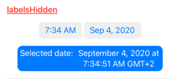
labelsHidden
Permite ocultar los labels del componente. Es muy útil cuando no queremos mostrar ningún texto, dejándonos posicionar el propio DatePicker a nuestro gusto:
struct ContentView: View {
    @State private var selectedDate: Date = Date()

    var dateFormatter: DateFormatter {
        let formatter = DateFormatter()
        formatter.dateStyle = .long
        formatter.timeStyle = .long
        return formatter
    }

    var body: some View {
        ScrollView {
            VStack(spacing: 15) {
                Group {
                    DatePicker("Select a date", selection: $selectedDate)
                        .labelsHidden()
                    HStack(alignment: .firstTextBaseline) {
                        Text("Selected date:")
                        Text("(selectedDate, formatter: dateFormatter)")
                            .multilineTextAlignment(.center)
                    }
                    .padding(.all, 5)
                    .foregroundColor(.white)
                    .background(Color.blue)
                    .clipShape(RoundedRectangle(cornerRadius: 10))
                    Divider()
                }
            }
            .padding()
        }
    }
}
Ejemplo
Puedes encontrar este ejemplo en github.com bajo el apartado DatePicker.

Rafael Fernández,
iOS Tech Lider